
Intro
Disclaimer: This article is intended for an audience already familiar with MAUI. Explanations are concise and may be challenging for beginners.
Welcome to this series of articles where we’ll build a complete Design System library of custom controls in MAUI. This article builds on the previous one MAUI (CraftUI Part 6) Custom Button with Progress Bar.
One major limitation in .NET MAUI today is the lack of a nullable DatePicker, a feature often required in form scenarios. While the issue #1100 is still open, there’s no native support yet.
In this article, I’ll walk you through how to implement a nullable DatePicker control in .NET MAUI, ensuring a native look and feel across platforms, while giving you full control over how null states are handled in your UI.
Goal
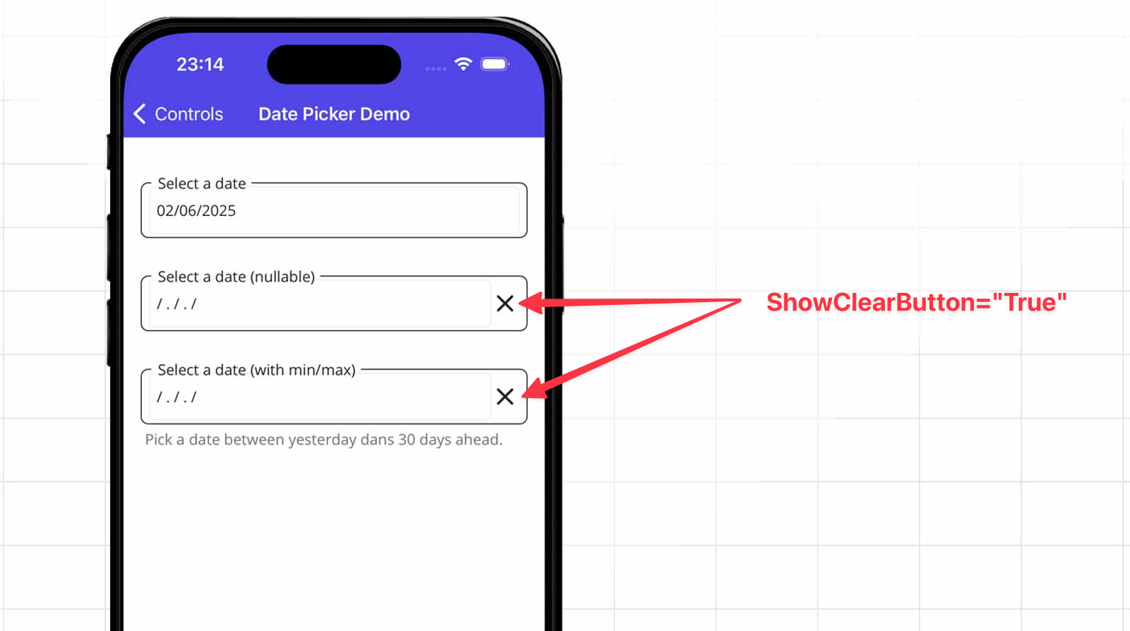
We’ll use the native DatePicker control embedded within our well-known LabelBase, combined with an image icon to display a clear button, toggled by the ShowClearButton property.
The final result will look like this:
Implement the CfDatePicker control
We’re building a new control named CfDatePicker, which embeds a DatePicker inside our LabelBase and includes a close icon (cross) on the right side.
Basically, there are two states:
- The standard DatePicker, where a DateTime is bound.
- A nullable state, where we show a placeholder and display the close (clear) button.
Below is the list of properties for CfDatePicker.
- PlaceHolder: Text displayed when no date is selected, the default value I used is “/ . / . /”.
- NullableDate: The selected date that can be null, allowing the field to be cleared.
- Format: Defines how the selected date is displayed (e.g., “dd/MM/yyyy”).
- MinimumDate: Sets the earliest selectable date in the picker.
- MaximumDate: Sets the latest selectable date in the picker.
- ShowClearButton: Determines whether the clear (X) button is visible to reset the date.
Now let’s explore the full code behind the CfDatePicker control.
–> CraftUI.Library.Maui/Controls/CfDatePicker.xaml.cs
public partial class CfDatePicker
{
    public static readonly BindableProperty PlaceHolderProperty =
    BindableProperty.Create(nameof(PlaceHolder), typeof(string), typeof(CfDatePicker),
            defaultValue: "/ . / . /");
    public static readonly BindableProperty NullableDateProperty =
    BindableProperty.Create(nameof(NullableDate), typeof(DateTime?), typeof(CfDatePicker),
            defaultValue: null, defaultBindingMode: BindingMode.TwoWay);
    public static readonly BindableProperty FormatProperty =
    BindableProperty.Create(nameof(Format), typeof(string), typeof(CfDatePicker),
            defaultValue: "d", propertyChanged: OnFormatChanged);
    public static readonly BindableProperty MinimumDateProperty =
    BindableProperty.Create(nameof(MinimumDate), typeof(DateTime), typeof(CfDatePicker),
            propertyChanged: OnMinimumDateChanged);
    public static readonly BindableProperty MaximumDateProperty =
    BindableProperty.Create(nameof(MaximumDate), typeof(DateTime), typeof(CfDatePicker),
            propertyChanged: OnMaximumDateChanged);
    public static readonly BindableProperty ShowClearButtonProperty =
    BindableProperty.Create(nameof(ShowClearButton), typeof(bool), typeof(CfDatePicker),
            defaultValue: true, propertyChanged: OnShowClearButtonChanged);

    public string PlaceHolder
    {
        get => (string)GetValue(PlaceHolderProperty);
        set => SetValue(PlaceHolderProperty, value);
    }

    public DateTime? NullableDate
    {
        get => (DateTime?)GetValue(NullableDateProperty);
        set => SetValue(NullableDateProperty, value);
    }

    public string Format
    {
        get => (string)GetValue(FormatProperty);
        set => SetValue(FormatProperty, value);
    }

    public DateTime MinimumDate
    {
        get => (DateTime)GetValue(MinimumDateProperty);
        set => SetValue(MinimumDateProperty, value);
    }

    public DateTime MaximumDate
    {
        get => (DateTime)GetValue(MaximumDateProperty);
        set => SetValue(MaximumDateProperty, value);
    }

    public bool ShowClearButton
    {
        get => (bool)GetValue(ShowClearButtonProperty);
        set => SetValue(ShowClearButtonProperty, value);
    }

    public CfDatePicker()
    {
        InitializeComponent();
        Element.DateSelected += OnDateSelected;

        var tapped = new TapGestureRecognizer();
        tapped.Tapped += (_, _) =>
        {
            Element.Date = DateTime.Today;
            NullableDate = null;
        };
        CloseImage.GestureRecognizers.Add(tapped);
    }

    private static void OnFormatChanged
        (BindableObject bindable, object oldValue, object newValue) =>
            ((CfDatePicker)bindable).OnFormatChanged();
    private static void OnMinimumDateChanged
        (BindableObject bindable, object oldValue, object newValue) =>
            ((CfDatePicker)bindable).OnMinimumDateChanged();
    private static void OnMaximumDateChanged
        (BindableObject bindable, object oldValue, object newValue) =>
            ((CfDatePicker)bindable).OnMaximumDateChanged();
    private static void OnShowClearButtonChanged
        (BindableObject bindable, object oldValue, object newValue) =>
            ((CfDatePicker)bindable).UpdateClearButtonVisibility();

    private void OnDateSelected(object? sender, DateChangedEventArgs e)
    {
        NullableDate = e.NewDate;
    }

    protected override void OnBindingContextChanged()
    {
        base.OnBindingContextChanged();

        if (BindingContext != null)
        {
            Element.Format = PlaceHolder;
        }
    }

    protected override void OnPropertyChanged(string? propertyName = null)
    {
        base.OnPropertyChanged(propertyName);

        if (propertyName == NullableDateProperty.PropertyName)
        {
            if (NullableDate.HasValue)
            {
                Element.Date = NullableDate.Value;
            }

            UpdateDateView();
        }
    }

    public void OnFormatChanged()
    {
        Element.Format = Format;
        UpdateDateView();
    }

    public void OnMinimumDateChanged()
    {
        Element.MinimumDate = MinimumDate;
    }

    public void OnMaximumDateChanged()
    {
        Element.MaximumDate = MaximumDate;
    }

    private void UpdateClearButtonVisibility()
    {
        CloseImage.IsVisible = ShowClearButton;
    }

    private void UpdateDateView()
    {
        if (NullableDate.HasValue)
        {
            Element.Date = NullableDate.Value;
            Element.Format = Format;
        }
        else
        {
            Element.Format = PlaceHolder;
        }
    }
}
Nothing fancy here, just a simple and lightweight way to implement a nullable DatePicker.
You can bind the NullableDate property to either a DateTime or a DateTime?, making it flexible for both required and optional date scenarios.
Let’s take a look at the view definition to understand how the CfDatePicker is structured visually.
–> CraftUI.Library.Maui/Controls/CfDatePicker.xaml
<common:LabelBase
    xmlns="http://schemas.microsoft.com/dotnet/2021/maui"
    xmlns:x="http://schemas.microsoft.com/winfx/2009/xaml"
    xmlns:common="clr-namespace:CraftUI.Library.Maui.Common"
    xmlns:controls="clr-namespace:CraftUI.Library.Maui.Controls"
    x:Class="CraftUI.Library.Maui.Controls.CfDatePicker">

    <controls:CfDatePicker.Resources>
        <Style TargetType="Image" x:Key="ClosePopupImage">
            <Setter Property="WidthRequest" Value="26" />
            <Setter Property="HeightRequest" Value="26" />
            <Setter Property="HorizontalOptions" Value="End" />
        </Style>
    </controls:CfDatePicker.Resources>

    <common:LabelBase.View>
        <Grid ColumnDefinitions="*,Auto">

            <DatePicker
                x:Name="Element"  />

            <Image
                Grid.Column="1"
                Style="{StaticResource ClosePopupImage}"
                x:Name="CloseImage"
                Source="close.png" />

        </Grid>
    </common:LabelBase.View>
</common:LabelBase>
Display CfDatePicker control in a page
Now, we all want to test this control on a new page in some cases.
If you’ve read my previous articles, you already know my way of building pages.
Let’s have three behaviors of our CfDatePicker:
- First one: a normal DatePicker and bind a DateTime property (no nullable).
- Second one: set a nullable date with ShowClearButton to True and bind a DateTime? property
- Third one: set a nullable date with a minimum and maximum date range
–> CraftUI.Demo/Presentation/Pages/Controls/DatePickers/DatePickerPage.xaml
<base:ContentPageBase
    xmlns="http://schemas.microsoft.com/dotnet/2021/maui"
    xmlns:x="http://schemas.microsoft.com/winfx/2009/xaml"
    xmlns:base="clr-namespace:CraftUI.Demo.Presentation.Common"
    xmlns:page="clr-namespace:CraftUI.Demo.Presentation.Pages.Controls.DatePickers"
    xmlns:controls="clr-namespace:CraftUI.Library.Maui.Controls;assembly=CraftUI.Library.Maui"
    x:Class="CraftUI.Demo.Presentation.Pages.Controls.DatePickers.DatePickerPage"
    x:DataType="page:DatePickerPageViewModel"
    Title="Date Picker Demo">

    <Grid RowDefinitions="*,Auto" >
        <ScrollView>
            <VerticalStackLayout
                Margin="16, 32"
                Spacing="25">

                <controls:CfDatePicker
                    Label="Select a date"
                    NullableDate="{Binding Date}"
                    ShowClearButton="False"  />

                <controls:CfDatePicker
                    Label="Select a date (nullable)"
                    NullableDate="{Binding DateNullable}"
                    ShowClearButton="True" />

                <controls:CfDatePicker
                    Label="Select a date (with min/max)"
                    NullableDate="{Binding RangeDateNullable}"
                    MinimumDate="{Binding MinimumDate}"
                    MaximumDate="{Binding MaximumDate}"
                    ShowClearButton="True"
                    Info="Pick a date between yesterday dans 30 days ahead."/>

            </VerticalStackLayout>
        </ScrollView>
    </Grid>

</base:ContentPageBase>
–> CraftUI.Demo/Presentation/Pages/Controls/DatePickers/DatePickerPageViewModel.cs
public partial class DatePickerPageViewModel : ViewModelBase
{
    private readonly ILogger<DatePickerPageViewModel> _logger;

    [ObservableProperty]
    private DateTime _date;

    [ObservableProperty]
    private DateTime? _dateNullable;

    [ObservableProperty]
    private DateTime? _rangeDateNullable;

    [ObservableProperty]
    private DateTime _minimumDate;

    [ObservableProperty]
    private DateTime _maximumDate;

    public DatePickerPageViewModel(
        ILogger<DatePickerPageViewModel> logger)
    {
        _logger = logger;

        MinimumDate = DateTime.Now.AddDays(-1);
        MaximumDate = DateTime.Now.AddDays(30);

        _logger.LogInformation("Building DatePickerPageViewModel");
    }

    public override void OnAppearing()
    {
        _logger.LogInformation("OnAppearing()");

        Date = DateTime.Now;
        DateNullable = null;
        RangeDateNullable = null;

        base.OnAppearing();
    }
}
Let’s test our control, below the result !!
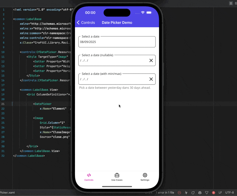
Did you notice something? There’s a little glitch. Clicking today’s date doesn’t update the picker, kinda annoying, right? 😅
The reason is simple, we rely on DateSelected, so the UI only updates when a new date is picked via UpdateDateView().
Since a DatePicker can’t be null, we reset its value to today whenever NullableDate is null. Check again the code from the constructor of the control.
public CfDatePicker()
{
    InitializeComponent();
    Element.DateSelected += OnDateSelected;

    var tapped = new TapGestureRecognizer();
    tapped.Tapped += (_, _) =>
    {
        // Trigger when the need to be null.
        Element.Date = DateTime.Today;
        NullableDate = null;
    };
    CloseImage.GestureRecognizers.Add(tapped);
}
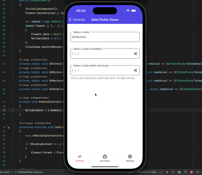
Fixing the DatePicker Issue When Selecting the Current Day
Well, we have a problem because the DatePicker doesnt fire for DateSelected event on same date.
It’s clearly explained in issue 13156 on the MAUI repository.
Thankfully, the community suggested a workaround: instead of relying on the default DatePicker, we can use a custom override control, I will name it CfDatePickerInternal.
–> CraftUI.Library.Maui/Controls/CfDatePickerInternal.cs
public class CfDatePickerInternal : DatePicker, IDatePicker
{
    DateTime IDatePicker.Date
    {
        get => Date;
        set
        {
            if (value.Equals(DateTime.Today.Date))
            {
                Date = value.AddDays(-1);
            }

            Date = value;
            OnPropertyChanged();
        }
    }
}
Now use this CfDatePickerInternal into our CfDatePicker.
–> CraftUI.Library.Maui/Controls/CfDatePicker.xaml
<!-- ... -->
<common:LabelBase.View>
    <Grid ColumnDefinitions="*,Auto">

        <controls:CfDatePickerInternal
            x:Name="Element"  />

        <Image
            Grid.Column="1"
            Style="{StaticResource ClosePopupImage}"
            x:Name="CloseImage"
            Source="close.png" />

    </Grid>
</common:LabelBase.View>
<!-- ... -->
Ideally, I’d prefer to make this control internal to restrict its usage to the CraftUI.Library.Maui project only.
But we need to copy the DatePicker style and applying to this new control to look and like exactly like a DatePicker.
–> CraftUI.Demo/Resources/Styles/CustomControls.xaml
 <ResourceDictionary
    xmlns="http://schemas.microsoft.com/dotnet/2021/maui"
    xmlns:x="http://schemas.microsoft.com/winfx/2009/xaml"
    xmlns:controls="clr-namespace:CraftUI.Library.Maui.Controls;
        assembly=CraftUI.Library.Maui">

    <Style TargetType="controls:CfDatePickerInternal">
        <Setter
            Property="TextColor"
            Value="{AppThemeBinding
                        Light={StaticResource Gray900},
                        Dark={StaticResource White}}" />
        <Setter Property="BackgroundColor" Value="Transparent" />
        <Setter Property="FontFamily" Value="OpenSansRegular"/>
        <Setter Property="FontSize" Value="14"/>
        <Setter Property="MinimumHeightRequest" Value="44"/>
        <Setter Property="MinimumWidthRequest" Value="44"/>
        <Setter Property="VisualStateManager.VisualStateGroups">
            <VisualStateGroupList>
                <VisualStateGroup x:Name="CommonStates">
                    <VisualState x:Name="Normal" />
                    <VisualState x:Name="Disabled">
                        <VisualState.Setters>
                            <Setter
                                Property="TextColor"
                                Value="{AppThemeBinding
                                            Light={StaticResource Gray200},
                                            Dark={StaticResource Gray500}}" />
                        </VisualState.Setters>
                    </VisualState>
                </VisualStateGroup>
            </VisualStateGroupList>
        </Setter>
    </Style>

</ResourceDictionary>
See it in action
Let’s see the CfDatePicker in action.
If you enjoyed this article, please consider starring the CraftUI project on GitHub.
Conclusion
The full code is available on GitHub, with a working example.
Since .NET MAUI doesn’t natively support null values in DatePickers, this control fills that gap by including a “clear” button that lets users reset the field.
It also supports a visual placeholder, customizable display, and optional minimum and maximum date bounds.
By implementing this control natively instead of using a NuGet package, you maintain full control over its customization and evolution, from updating styles to adding new bindable properties as needed.
If you enjoyed this blog post, then follow me on LinkedIn, subscribe the newsletter so you don’t miss out on any future posts. Don’t forget to share this with your friends and colleagues who are interested in learning about this topic. Thank you 🥰
Happy coding!

 By
By

%20Custom%20DatePicker%20Nullable)